One-page websites under investigation ?
One-page site, mini-site, micro-site and landing pages. I am sure you have heard of all of those terms but, do you know the difference between them? This post will help you understand what each of those words means, what are their pros and cons, and reach a conclusion as to which one best fits your needs. Are you ready? Let us get started!
One-page, mini-page, micro-page, landing page: making sense of it all

What is a one-page website?
A one-page website, or single-page website is one that fits on a single page. It is a growing trend in mobile-first web design as mobile usage overtakes desktop and, moreover, it is an affordable and practical first step for small businesses.
PROS and cons of a one-page website
PROS of a one-page website
Good usability
Although 30 years ago people were not used to scrolling, nowadays it is absolutely natural to do so. If beforehand websites with multiple pages were preferred to longer one-page websites, this is no longer the case. The only thing you have to worry about is following specific design principles and providing content that keeps your visitors interested (which I am sure you already considered).
Many studies prove that people do scroll. Let is have a look at these three remarkable statistics about page interactions:
- The company Huge conducted user testing with 48 participants over three days to know how page design impacts user behaviours and how visual cues help users scroll below the fold. They learned that “participants almost always scrolled, regardless of how they are cued to do so”. See further details on this link.
- Jared M. Spool’s usability tests concluded that, even though people say they do not like scrolling, they are willing to do so. You may read the full article here.
Former Clicktale, now called Contentsquare, conducted a study using their heat maps and deduced that people used the scrollbar on 76% of the pages, with 22% being scrolled to the very bottom regardless of the length of the page. More information on their blog.
Control the user experience
This model helps you effortlessly control and guide the user experience as they encounter all of your content in the order you want them to. It also allows you to make sure that the reader does not miss any essential information.
Responsive web design
According to Statista, 54,8% of the website traffic worldwide in the first quarter of 2021 was mobile. This is an undoubtedly prominent figure to consider as the study highlights a 23,2% rise since the first quarter of 2015.
Therefore, when building a website, instead of leaving this out of the spotlight, guide your efforts on offering a smooth experience.
Furthermore, navigation is more manageable from a mobile phone when you do not have to tap on a specific area. Also, mobile users are used to scrolling as that is what they do on social media.
Cons of a one-page website
Likely to confuse
If your website does not have distinguishable sections, users may be disoriented about where they are on the page. Just make sure you create easily recognisable breaks in content to avoid it.
Limited keyword optimisation
It can be challenging to include all of your keywords in just one page without making your content look like spam. Nevertheless, you may score higher on your page authority because you will always have a 1:1 of link to pages as all the traffic will drive to the homepage.
Just make sure that content above the fold is really worth reading and attractive enough to encourage users to keep on reading your article.
Mini-sites and microsites

What is a mini-site?
A mini-site has a smaller footprint on the Internet and is most often contemplated to highlight a single product or service, or to meet a particular business objective using a small number of customized websites. As its purpose is so defined, it does not need many pages to achieve its goals.
What is a microsite?
A microsite lives just outside of the company homepage or brand URL. These sites are generally temporary or seasonal and are focused on a particular goal, such as raising awareness for an event or A/B testing a copy.
What is the difference between a mini-site and a micro-site?
It is pretty simple. A mini-site is a small website, while a microsite is a self-contained page or group of pages meant to supplement a more extensive website.
As the pros and cons of a mini-site and microsite may be pretty similar, we will bracket them together for this purpose.
Pros and cons of a microsite and a mini-site
Pros of a microsite and a mini-site
They are very easy to consume
Microsites are very easy to consume because the information shared is very focused on a particular product or service. Moreover, it is very easy to stay in this type of website and therefore to make the customer stay engaged.
Less risky for your brand
If your microsite does not have the desired effect, it is easy to send away the adverse effects and continue as normal without an issue. This is because microsites are not connected to a company’s core domain. Being an excellent way to experiment with new ideas, many companies use them to launch a new product.
Cons of a microsite and a mini-site
They can confuse your audience
When your customers come across your microsite and see you experimenting with distinct tones of voice and other parameters, they may question your core identity and wonder if you are as genuine as you seem.
It may not be that inexpensive
A lot of people assume that microsites are much cheaper than ordinary websites, but this is not always the truth as many companies already have a primary site; this means that you could be taking on unnecessary additional expense if you are using your microsite to do something that you could have just easily done with your basic website.
Landing pages

What is a landing page?
We call a landing page a standalone web page created specifically for a marketing or advertising campaign that does not have website navigation.
Pros and cons of a landing page
Pros of a landing page
Helpful in increasing conversion rates
As they are very goal-oriented, they are thought to be the favourite option for increasing the conversion rates of your marketing campaigns and diminishing your cost per lead or sale acquisition. You will mainly find basic information and a call to action.
They build credibility
We often find customer testimonials showcasing satisfied customers. The point here behind social proof is that we are all more likely to make a purchase if we notice other people are happy with that product or service.
They can be tested
As we already mentioned, it is very simple to apply A/B testing on landing pages. This way, you can effortlessly fine-tune your web content and build a first-class solution for whatever goal the website has.
Cons of a landing page
Difficult to retrieve
As landing pages are situation-specific, you can only arrive at them from an email campaign, PPC advertisement, social media post, or a similar marketing campaign. This may derive into a frustrating user experience as the user will not retrieve it unless bookmarked or going back to the source.
Very concise
As they reveal minimal information, this may not satisfy many users. Remember the words of Will Rogers, “You Never Get A Second Chance to Make a First Impression”.
Please feel free to read our article on mobile landing pages and discover the different models adapted to your business model by clicking on this link.
The verdict
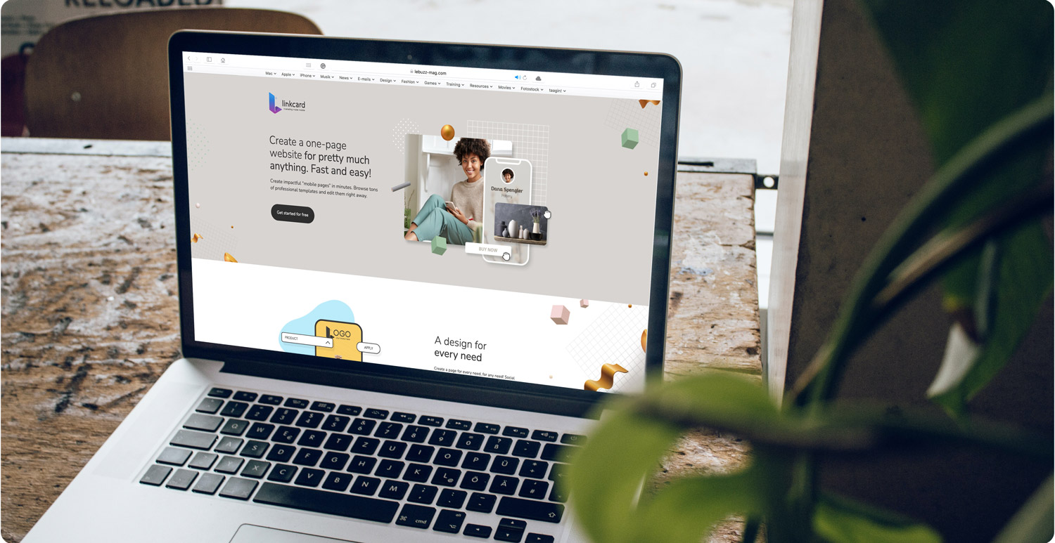
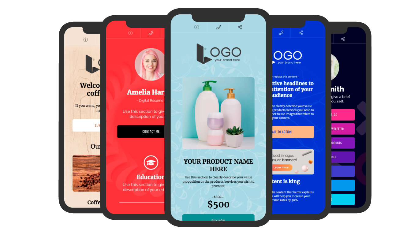
It is true that nowadays there are lots of tools available out there to help you build your own website or e-shop alone. But most of them are still quite sophisticated for the average user and require professional help. On the other hand, you can literally make a one-page website, customised and branded, in 5 minutes using platforms such as Linkcard.
Just like any other decision you make regarding your company, you always have to identify your target audience and goals to make a decision. All this considered, the counterparts of a one-page website can be easily sorted.
Want to learn more about Linkcard?
Sign in to our website and discover everything about our platform
